Brand & Package Design
Hands on Herbs


Hands On Herbs
Brand Identity
Intro ●
In a leap towards a fresh design direction, Hands on Herbs Organics, a proudly women-owned enterprise, embarked on a journey to revitalize its brand identity. By using bold and playful typographic choices, we orchestrated a modernization of the brand. The outcome is a visually captivating concept, characterized by its vibrant color palette, fluid illustrations, and playful typography.
Software ●
Adobe InDesign, Illustrator & Photoshop
PREVIOUS IDENTITY ●
PROCESS ●
● Color pallet
Embracing the idea of boldness, organic essence, and modernity, the brand underwent a transformative design evolution. The new identity seamlessly integrates vibrant colors and playful typography, serving as a vibrant testament to the brand's commitment to modernizing their design with creativity. The new design language focuses on the sense of freshness and vitality, resonating with modern consumers seeking authentic experiences.
Central to this revitalization is the infusion of a playful and bold typeface, injecting a sense of whimsy and character into the brands identity.
This bold choice not only reflects the brand's confident spirit but also underscores its commitment to standing out in a competitive market landscape.
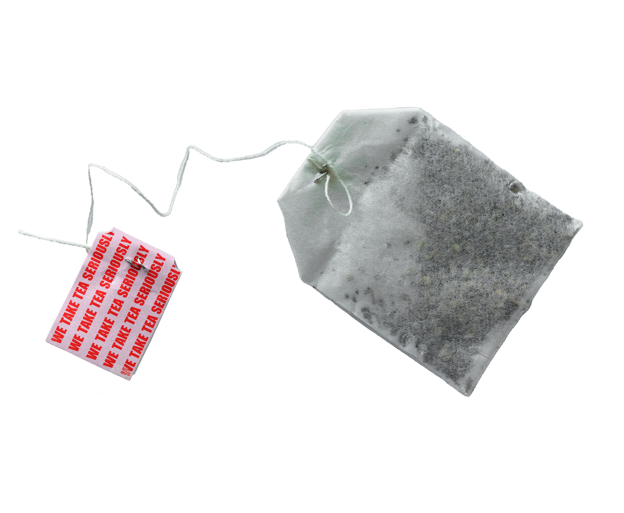
Retaining its signature bright colors, the revitalized identity pays homage to the brand's original inspiration while embracing a forward-thinking approach. Furthermore, the clever tea phrase "We take tea very seriously" remains a cornerstone of the brand's messaging, serving as a witty nod to its dedication to delivering exceptional tea experiences.


